
Can captivating and effective design be created with Microsoft Office alone?
Regardless of medium or tools the foundations of design can still be followed and result in professional, thought provoking work.
When you mention Microsoft Office to a designer you will most likely be met with disdain. Working in Microsoft Office is a challenge most designers will have to face during their career.
This past spring I had the opportunity to attend a design conference on the east coast. Presenters would reference the horror of working on slide decks or making Microsoft templates for clients. Every creative in the room would give a knowing laugh, feel closer and understood.
It made me think, is Microsoft Office really that bad? Is software that is common place for most office structures and departments...evil? These projects are profiting agencies, helping their client’s and giving me work as an in-house designer.
A DESIGN LIMITATION
What if you didn’t have access to Adobe Creative Suite? What if you couldn’t afford it? What if you only had access to Microsoft Office? I decided I wanted to challenge the idea that Microsoft Office is difficult to use for design and set out to create a project, for a real client, using only Microsoft Office.
I wanted to create an example for other designers and creatives of what can be accomplished when limitations are in place. I find I work best and most creatively when my options are limited. Its easier to work past the ‘paralysis of choice’ that blocks us from knowing where to start.
Ultimately my goal was for the work, to be the work. The client or anyone looking at the project will have no idea what is was created in or that it was created with Microsoft Office.
The obstacle in the path becomes the path. Never forget, within every obstacle is an opportunity to improve our condition.
Ryan Holiday, The Obstacle Is the Way: The Timeless Art of Turning Adversity to Advantage.

THE CLIENT
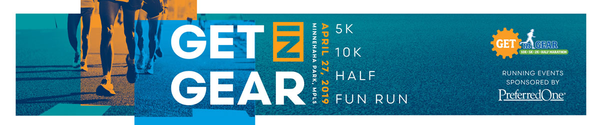
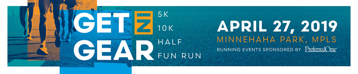
I reached out to Get in Gear, a Minneapolis running event that takes place in each April. We partnered to create new marketing materials for the 2019 race. The project followed the standard phases of a design project: brainstorming, concepting, revisions, etc. However, I did not inform them of my self imposed creative constraint.
There were four marketing projects that were needed for the 2019 race. This included a print ad for a local running publication, a postcard mailing, a bus advertisement and social media assets. Along with these marketing materials, I designed concepts for the race t-shirt.
PROJECT ONE: LEARNING THROUGH CONCEPTING
Since this project is based on setting a major limitation and design constraint there was one hard rule: no Adobe Creative Suite. I allowed myself to utilize other standard creative tools such as sketching, photography, scanners and hand drawing if applicable. Also, any plug-ins that were available for Microsoft could be used.
To create the first concepts for a print ad for Get in Gear I used both Microsoft Word and PowerPoint. While creating these concepts I learned how to draw, bring in SVG file (vector art) and work with photo capabilities inside the Microsoft programs. While the features are essentially the same in both programs, Microsoft Word does a better job of outputting high quality PDFs
.

CONCEPT ONE: GEAR THEME
Based on elements included in the original Get in Gear logo this concept used the gear and a bridge. This bridge resembles the Ford Parkway bridge which runners cross, connecting the two cities of Minneapolis and St. Paul.

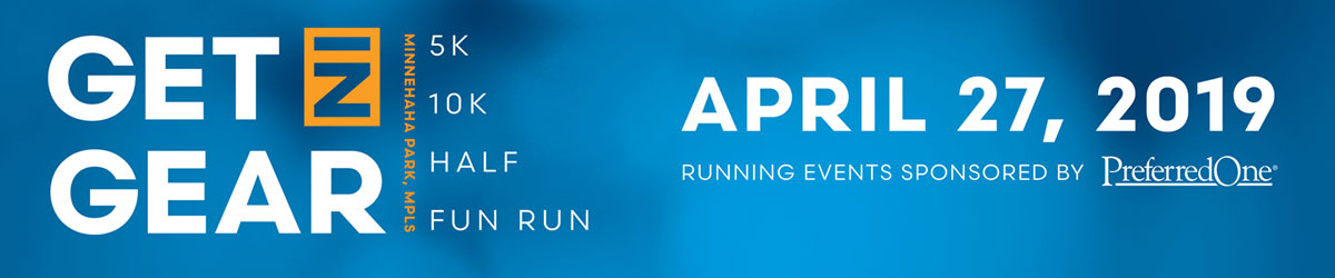
CONCEPT TWO: TYPE THEME
Concept two relies heavily on bold typography and the use of duotone imagery. The color palette for this theme most closely mimics the existing Get in Gear color palette.

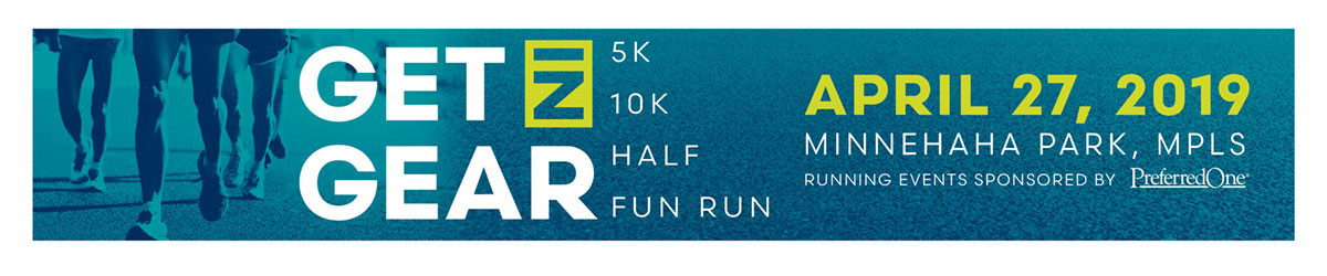
CONCEPT THREE: 42ND THEME
2019 will be the 42nd annual Get in Gear making it one of the longest lasting running events in the Twin Cities area. Also, this theme introduced a completely new color palette.


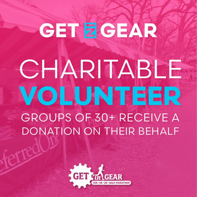
PROJECT TW: SOCIAL MEDIA ASSETS
Initial concepts for the social media components were created using PowerPoint. PowerPoint has the most options for exporting work to image formats such as jpegs and png files.
Get in Gear liked the bright colors that were used. The new colorful content will grab attention on social media.
Feedback was received from an outside marketing resource with an extensive background in running. They thought these new social media pieces felt current and refreshed. Also, the information presented was appropriate and important too the race.
PROJECT THREE: POSTCARD
Concepts for this part of the project were created in Microsoft Word. Similar to the print ad, Microsoft Word outputs the best PDF.
Three concepts were shown to Get in Gear before arriving on the final postcard design. Get in Gear was drawn to the orange option because it used the new design in a different way. They liked the orange piece because it was bright and connected with their brand. Since this is a simple Save the Date postcard they only repeated the race date on the backside of the card. These postcards will be printed and mailed to anyone who previously has participated in Get in Gear. Its one of their best ways to get past runners to return the next year.

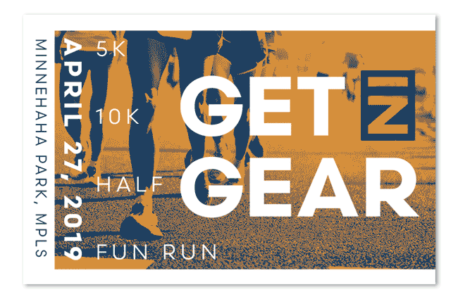
PROJECT FOUR: BUS AD
Concepts for this part of the project were created in PowerPoint. Bus advertisements when scaled are 24” by 5” and must have a resolution of 600 dpi at this size. Microsoft Word has size limitations. The largest a document can be is 22” wide. This was the first big issue I had with Word.
Four concepts were shown to Get in Gear (as seen below) before selecting the final bus ad. Get in Gear realized that bus advertisements need to be brief. Most people see them only for a few seconds. This is why they selected the concept with the date displaying prominently. The bus ad will be on Twin Cities area buses in the months before Get in Gear.
GRAPHIC DESIGN CAN BE CREATED USING MANY DIFFERENT TOOLS. DESIGN WILL BE A SUCCESSFUL WHEN IT IS ROOTED IN PROCESS AND DESIGN FOUNDATIONS.
CONCLUSION
Can captivating and effective design be created with Microsoft Office alone? Yes, it can. And yes, at times it is frustrating but it is possible. I was able to execute high quality projects for a client using many of the same methods I would use had I had access to the Adobe products.
Did the client’s design suffer? No, while the end result may have been a little different had I used other design software, the client still received high quality designs.
The greatest takeaway is accessibility. I believe more people have access to Microsoft Office and are less intimated by it than other design software. Using Office as a design tool could enable those people to create designs. It is also less costly than other design software.
Graphic design can be created using many different tools. Design will be a successful when it is rooted in process and design foundations.
More process documentation available at my Progress Platform. PDF summary of project, including references, available here